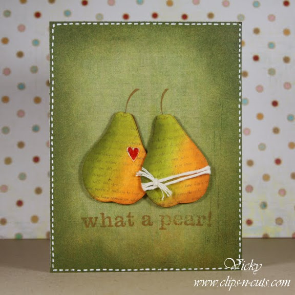
The first weekend video of 2011 is here. I made a card which can be used as a Valentine’s or anniversary or wedding card.

and a closer look to that cute little heart with glossy accent

I get a lot of questions about distress inks and how I use them on clear stamps. Distress ink is for distressed look, so don’t expect perfect impressions. If you are looking for a clean and perfect look then you should use dye or chalk inks on clear stamps. You can see the sentiment here as an example.
Note: If you want to subscribe to by blog and get email notifications every time I make a post, enter your email on the right sidebar. Thanks!
Enjoy the video and thanks for visiting. Subscribe to my YouTube channel and help me reach 1000 subscribers! (one of my New Year’s “blog resolutions”). Supplies are at the bottom of this post.
Supplies:


wonderful card! They look like real 🙂
So great you’re back! Loved the card and love the way you distressed it! Really brought the pears to life and added the deep color along the outer edge just gave it so much pop! Great job.
Lovely distressing to color the pears! I bought the Ranger craft sheet (the large size) and I wouldn’t craft without it anymore. I distress, paint, emboss, use my glue gun, and color with my copics on it and it takes it all! (Just don’t cut on it ;D)
Cute card! I’m already subscribed 2 ur YouTube channel. Hope u make it to 1000! Good luck 🙂
So beautiful card I love it =P
What a sweet card…your distressing is absolutely wonderful. Love this card and your fun video, Vicky! Keep up the amazing inspiration!
blessings
too cute….I love the pun!!!
This is just fabulous Vicki! I love all of that distressing! It makes me want to get inky!
Beautiful! Those pears are beautiful in those gorgeous distressed tones. Always learn something new from you. Thanks so much!
What a cute card. Love the distressing. Thanks for all your great videos.
Υπέροχη!
Amazing! Love this card… added to my favorites!
Looking to forward an inspiring 2011!
This card is GREAT! Thanks so much for sharing, I’m so glad to see your Weekend Videos! Subscribe to your feed so I get every one!
I LOVE your distressed pears!
Beautiful job on this card, love the colors and your pears are simply adorable!
I just love this card Vicky and the video was great too. You could be a hand model….add that to your list of all that to your list. Hugs,kathy
This card is just awesome. I am not so sure though! I am pear shaped!!
Other than that just gorgeous.
Totally love this card! TFS!!!
Beautiful design! And may I say you have beautiful hands and nails too :))
you and I are on the same wavelength this week 🙂 Loving your beautiful soft colourful pears, GORGEOUS card.
Very cute card. Love the colors and distressing.
Yeah, your weekly videos are back! Thanks so much … fabulous card as always!!!
Love it!
Welcome back – hope you had fab holidays.
What a wonderful video. Thanks for putting the link up on flickr.
LOVE the distressing abd design!! You ROCK, Vicky! I agree with Kathy that you sould add “hand model” to your profile/title!! Your hands can DO MAGIC 🙂 Love the blog and love you!
Loved the video and the card. So charming and beautiful. I have been wanting to add green inks to my Ranger distress inks because I only have peeled paint, and I have just learned from your card/film that I need both crushed olive and forest moss! Thanks!
Awesome video Vicky! Thank you!
Beautiful job on all that distressing! Wow. The card came out amazing. Thanks so much for another video! I love watching!
Thank you for your video!!
Here’s what came of it:
http://craftycre8tions.blogspot.com/2011/01/perfect-pair.html
Maria
just found your blog. loved it and have subscribed. all the cards are great; but I especially loved the ‘what a pear’ card. they look good enough to eat. I am just starting out with distress inks although I have been stamping for 4 years. am falling in love with them. thanks for the video.
This cardis absolutely gorgeous! I have watched your video for two weeks in a row and each time I am amazed! I hope to try a similar card this week. Thanks for sharing!
Beautiful card. Tried to find the stamp sets you used when i followed your links however after going through 30 pages of store items – no luck! Do they still carry them? Help!
Thanks!
The stamp sets I used for that cards were: “What a pear” by BasicGrey and “Simply the best” by Hero Arts. I am sure I was linking directly to those products but now I guess they are out of stock. Now you know the names of the stamps maybe you can find them somewhere else. Thank you so much for visiting and I hope I’ve helped.